Great choice this week, Alan.
I like a deviation every now and again. On the straight and narrow, little slip, down the side track - somewhere, something new, something different.
There are several themes that fit this weeks postings, advertising, graphics, poster art. The 20s and 30s were probably one of the most artistic and striking advertising periods. I have therefore chosen these Co-operative Wholesale Society postcards of the 1990s (I believe) depicting 1920s and 30s advertising. I picked these up in a traditional Junk Shop in Cumbria. This in itself was a little deviation from the norm. Once every little town had a Junk Shop where things were recycled. Now, at least, down here in the South, they are either over-priced Antique Shops (becoming rare) or Charity Shops (often several living cheek by jowl)


Up in the morning Cuppa and toast with Jam

On with the Overcoat


There are several themes that fit this weeks postings, advertising, graphics, poster art. The 20s and 30s were probably one of the most artistic and striking advertising periods. I have therefore chosen these Co-operative Wholesale Society postcards of the 1990s (I believe) depicting 1920s and 30s advertising. I picked these up in a traditional Junk Shop in Cumbria. This in itself was a little deviation from the norm. Once every little town had a Junk Shop where things were recycled. Now, at least, down here in the South, they are either over-priced Antique Shops (becoming rare) or Charity Shops (often several living cheek by jowl)

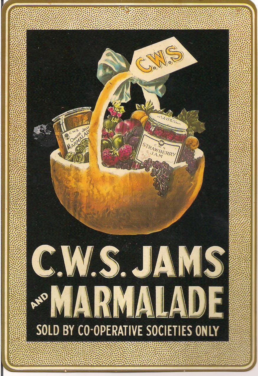
Up in the morning Cuppa and toast with Jam


Or "On Yer Bike"
Cup of Cocoa, light the candle

and so to bed says Zebadee
Those were a good find Mike.I can still remember C.W.S. being used on co-op branded goods. When I was achild my mum had a co-op dividend book and we had to quote the number every time we shopped so that we got our ‘divi’ at payout time. My mum used to rely on that.
ReplyDeleteA lot of charity shops in my local town are trying to go upmarket. One even told me we don't bother with old postcards - we just recyle them!
ReplyDeleteI remember CWS divi numbers too; I suppose you could argue that these have been replaced by loyalty cards.
You collected a fine set of cards here Mike; one or two look familiar.
I like the old advertising, especially the last one with the cats.
ReplyDeleteI hate to think of shops recycling old postcards. Some of them really are junk, but some are very collectible , and the average person can't tell what is worth saving.
Lovely cards based on such wonderful old posters. There is something about the shapes within the illustrations - simple and strong at the same time. Not the modern airbrushed celeb endorsement but humour and marketing in harmony.
ReplyDeleteSome of these are so beautiful that I want to go right out and buy the products, especially the marmalade.
ReplyDeleteThe marketing in these seems so much more benign than what we are used to nowadays. You feel as if you can trust them - little chance that I trust many advertisers nowadays.
ReplyDeleteThese adverts make me want to look at them and read them. Advertising agencies could benefit from studying them.
ReplyDeleteClassic design and very appropriate for the Sepia theme.
ReplyDeleteThey are a particularly attractive series of cards. The charity shops now seem to have everything picked through and valuable items sent either to their own specialist shops or auctioned. We do have a house clearance shop nearby (though they call themselves an antique shop after the Antiques Road Trip visited).
ReplyDeleteThese are gorgeous cards and reflective of their times. I especially like th cocoa one...fits with my advertising posts. Didn't realize before this week the prominence of advertiseing in the 30's.
ReplyDeleteWow, great advertising cards!
ReplyDeleteGreat post and fabulous cards!
ReplyDelete